Tailwind CSS under the hood
Tailwind CSS defines itself on its official site as:
A utility-first CSS framework packed with classes.
In this post I’ll explain to you what does utility-first mean and how Tailwind CSS works under the hood.
Utility-first
Utility classes are easily understood, single purpose classes. For example, Tailwind provides utility classes such as:
.mx-auto {
  margin-left: auto;
  margin-right: auto;
}
.text-sm {
font-size: 0.875rem;
line-height: 1.25rem;
}So when you want to horizontally center a paragraph with small font size, you can just use mx-auto text-sm as the class name of the element.
In this way, we can build complex components by combining different utility classes together.
3 main benefits of utility-first
Now we understand what is utility-first and let’s see the benefits of it:
1. Design with constraints
Using inline styles, every value is an arbitrary number. With utilities, you’re choosing styles from a predefined design system such as the default spacing scale:
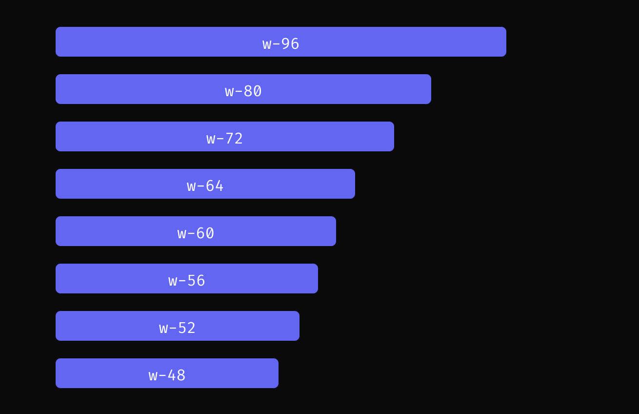
Take setting width for an example, you just use utility class such as w-48 or w-96, instead of specify the exact pixel you want. This makes it much easier to build visually consistent UIs.
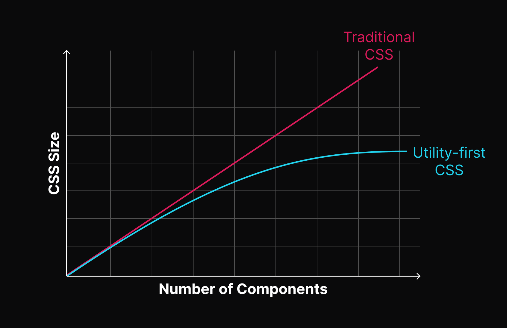
2. CSS stops growing
Using a traditional approach, your CSS files get bigger every time you add a new UI component. With utilities, everything is reusable. This means the size of your CSS file stops growing after a certain point because the same utility classes are used again and again.
3. No need to invent class names
With traditional CSS, you might be adding class names like sidebar-inner-wrapper just to be able to style a <div>. With utilities, you just composing them to build a complex style you want.
How Tailwind CSS works under the hood
Tailwind CSS works by scanning all of files for class names at build time, then generating all of the corresponding CSS for those styles.
The paths to all of your content files is specified by content section of your tailwind.config.js:
/** @type {import('tailwindcss').Config} */
module.exports = {
  content: ["./pages/**/*.{html,js}", "./components/**/*.{html,js}"],
  // ...
};
Tailwind use regular expression to detect class names. Therefore when you want to use utility class conditionally like the following syntax doesn’t work:
<div className={`text-${error ? "red" : "green"}-600`}>Lorem Ipsum</div>This is because the regular expression doesn’t match any class name.
Instead, you should use:
<div className={error ? "text-red-600" : "text-green-600"}>Lorem Ipsum</div>In the second approach, Tailwind can match the string 'text-red-600' and 'text-green-600' and then generates the corresponding CSS.
This also explains why you can’t use props to build class names. For example, this won’t work:
function Button({ color, children }) {
  return (
    <button className={`bg-${color}-600 hover:bg-${color}-500 ...`}>
      {children}
    </button>
  );
}
Instead, map props to complete class names that are statically detectable at build-time:
function Button({ color, children }) {
  const colorVariants = {
    blue: "bg-blue-600 hover:bg-blue-500",
    red: "bg-red-600 hover:bg-red-500",
  };

  return <button className={`${colorVariants[color]} ...`}>{children}</button>;
}
Wrap up
To sum up, we’ve learned that Tailwind CSS makes it easy to design neat and consistent websites. Knowing how it works also helps us understand why some things work well and others don’t, guiding us to use Tailwind more effectively!